Design Process

Discover

Define

Ideate

Deliver

This project combines databases, visual design, and an IoT system
to show the impact of humanity on marine life and elicit an
emotional response from the user. The prototype has great
potential to help raise awareness among teenagers about the need
to protect the oceans when marine life is at risk due to
environmental changes and human activities.
The technology I used: Figma,
Arduino, Adobe Photoshop, Adobe Illustrator
Role: UI/UX Designer and
Researcher
The target users of the prototype are Australian adolescents aged between 13 and 19.
Marine ecologists, Environmental and Educational organizations
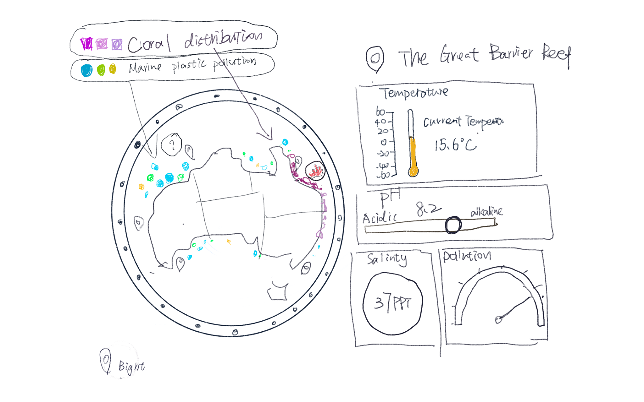
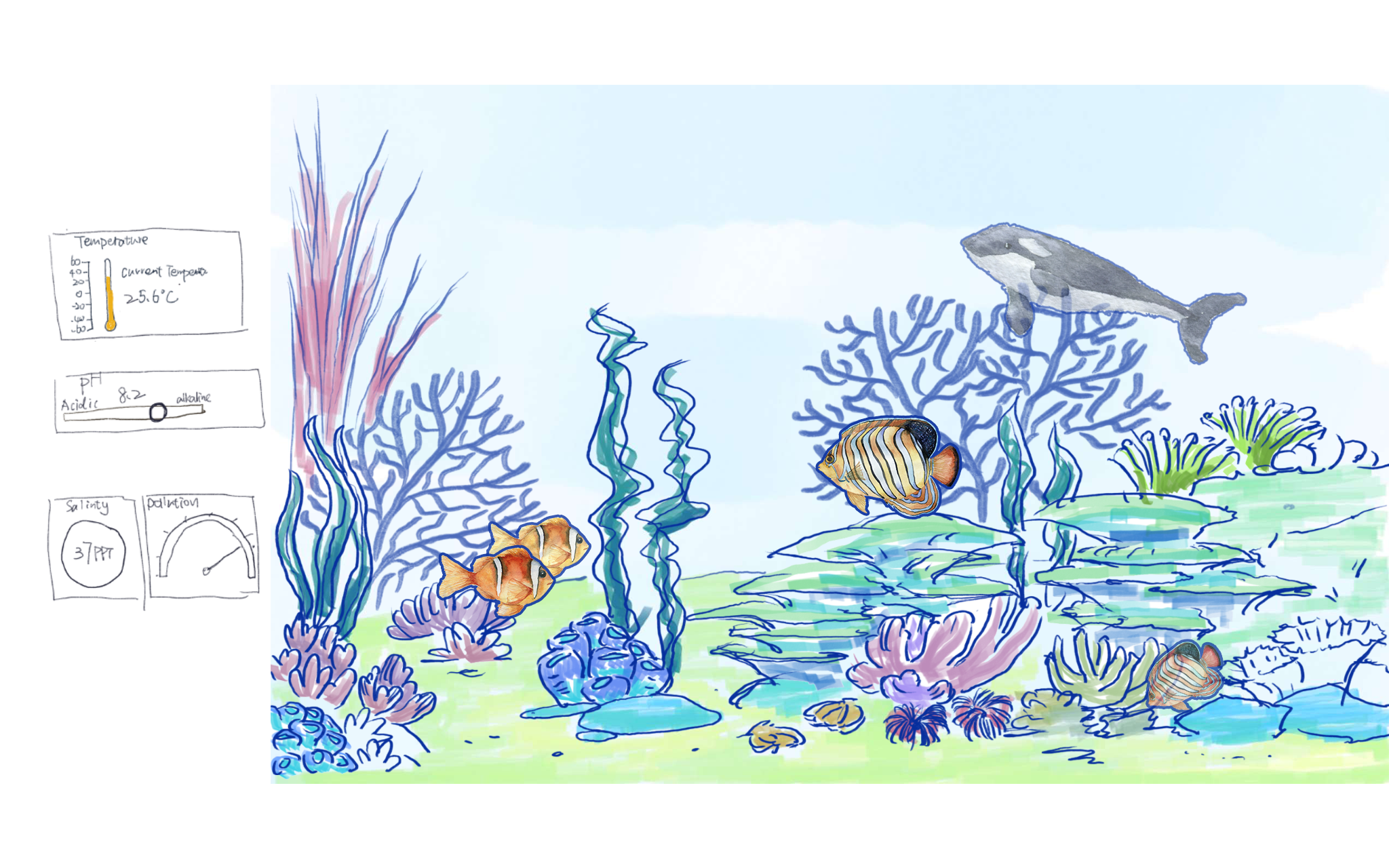
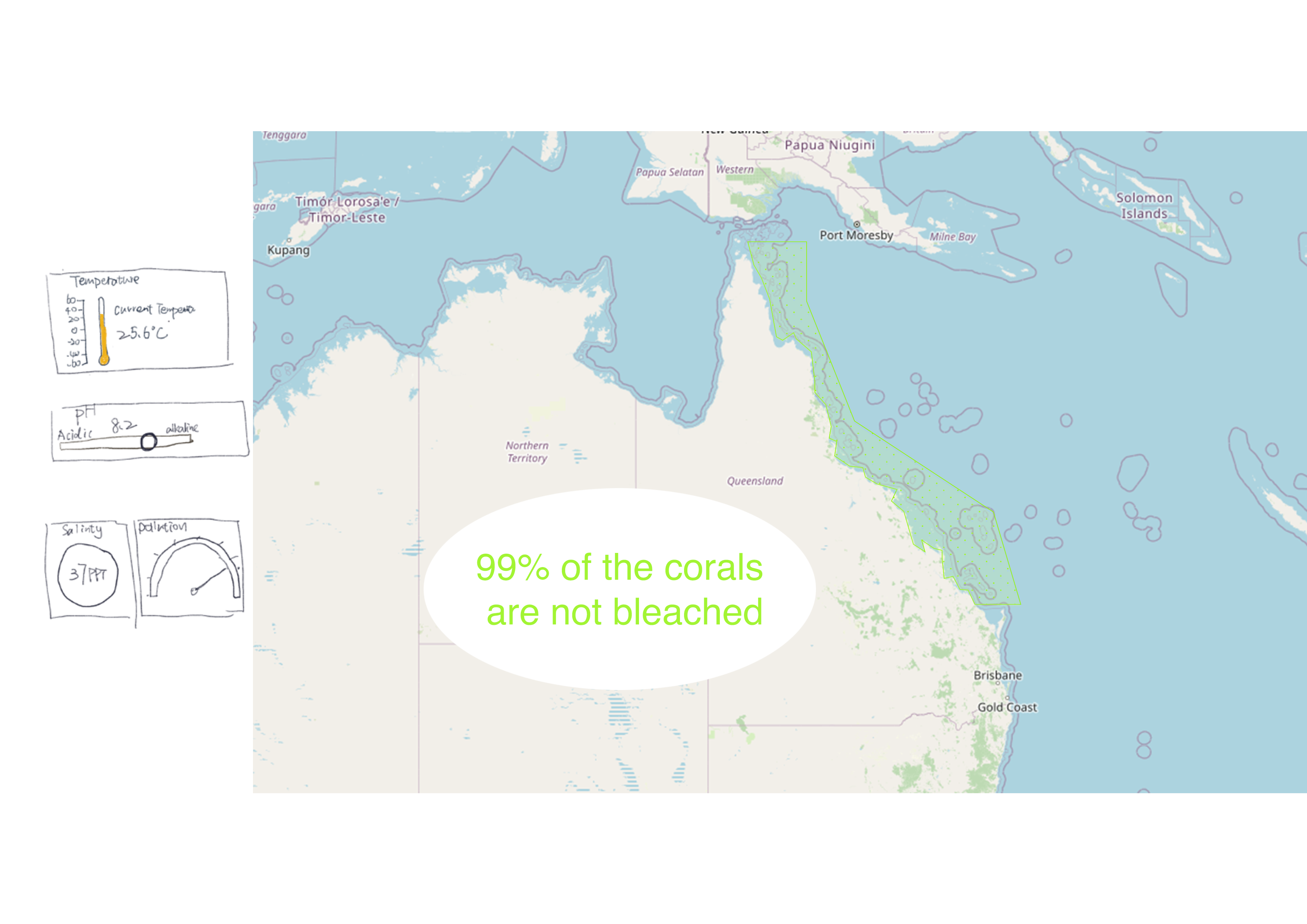
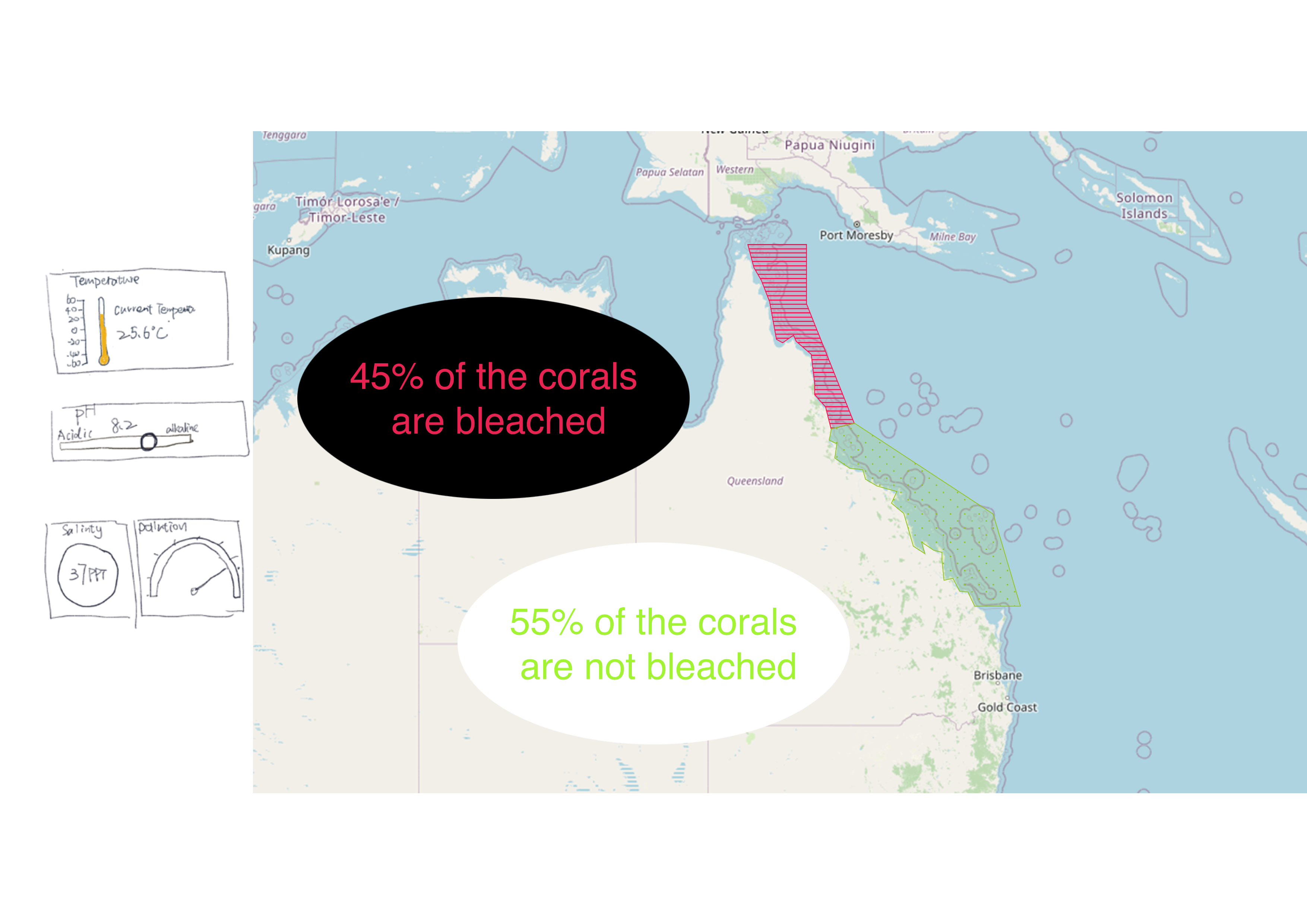
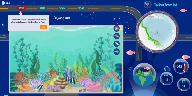
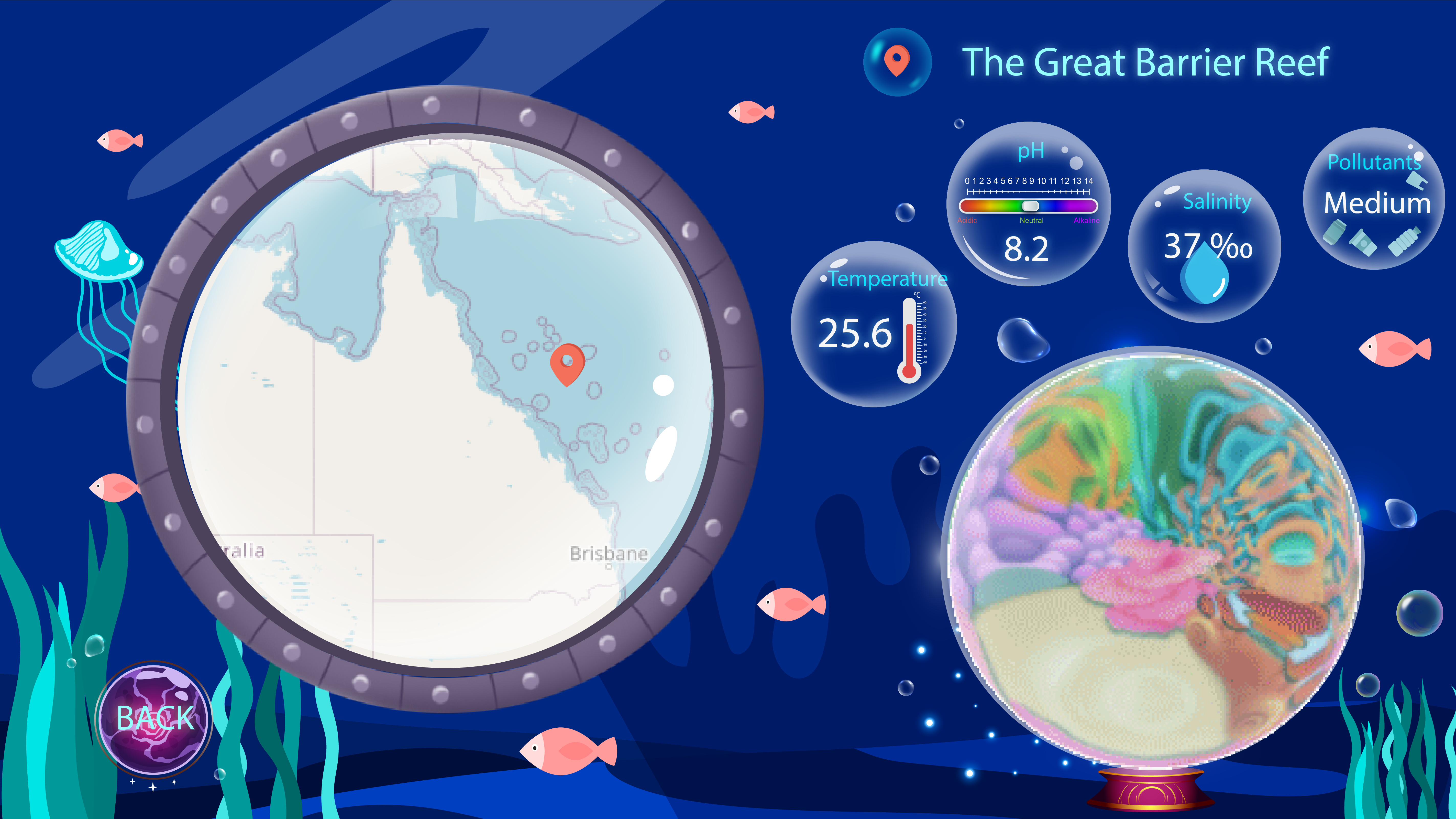
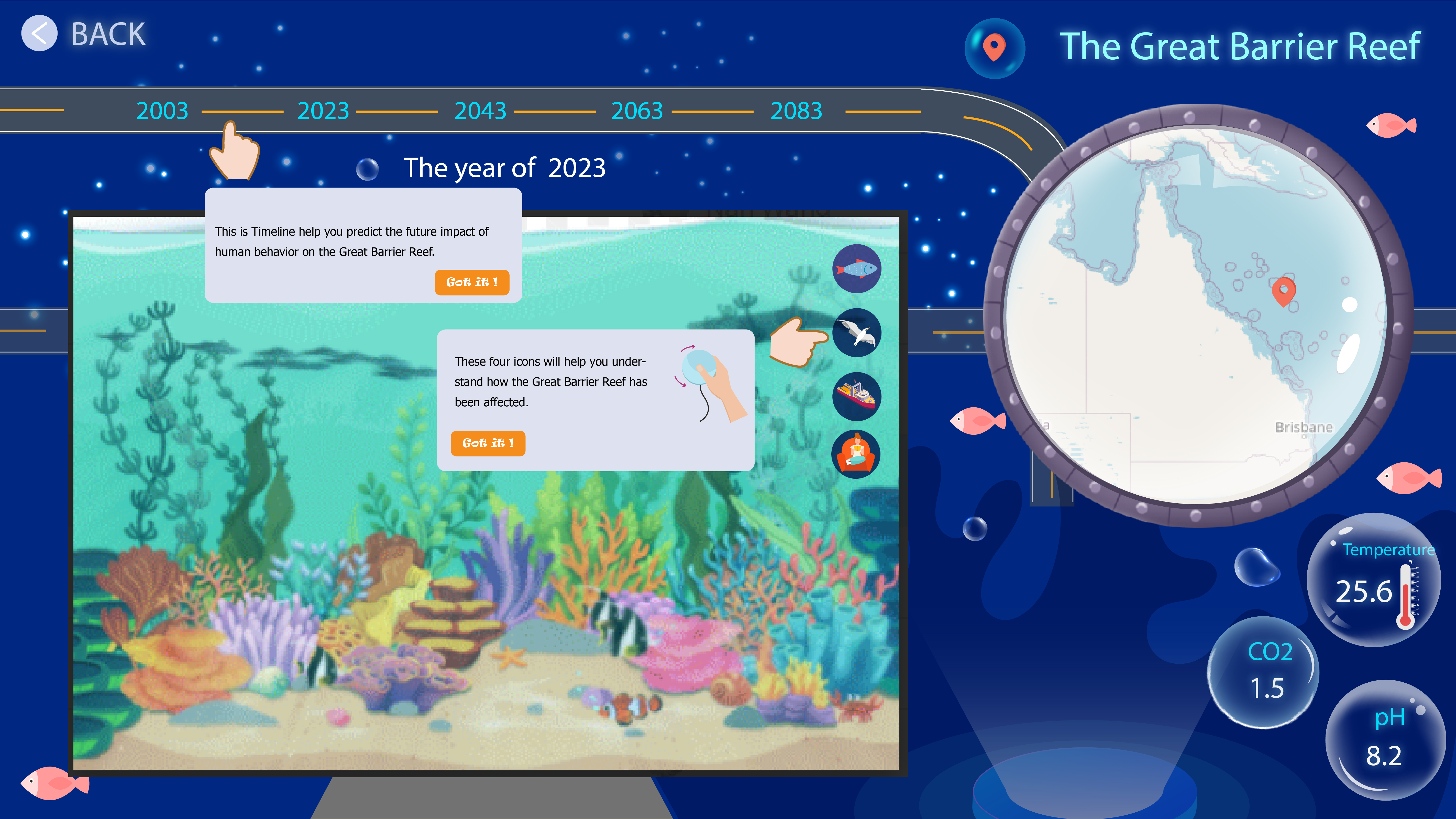
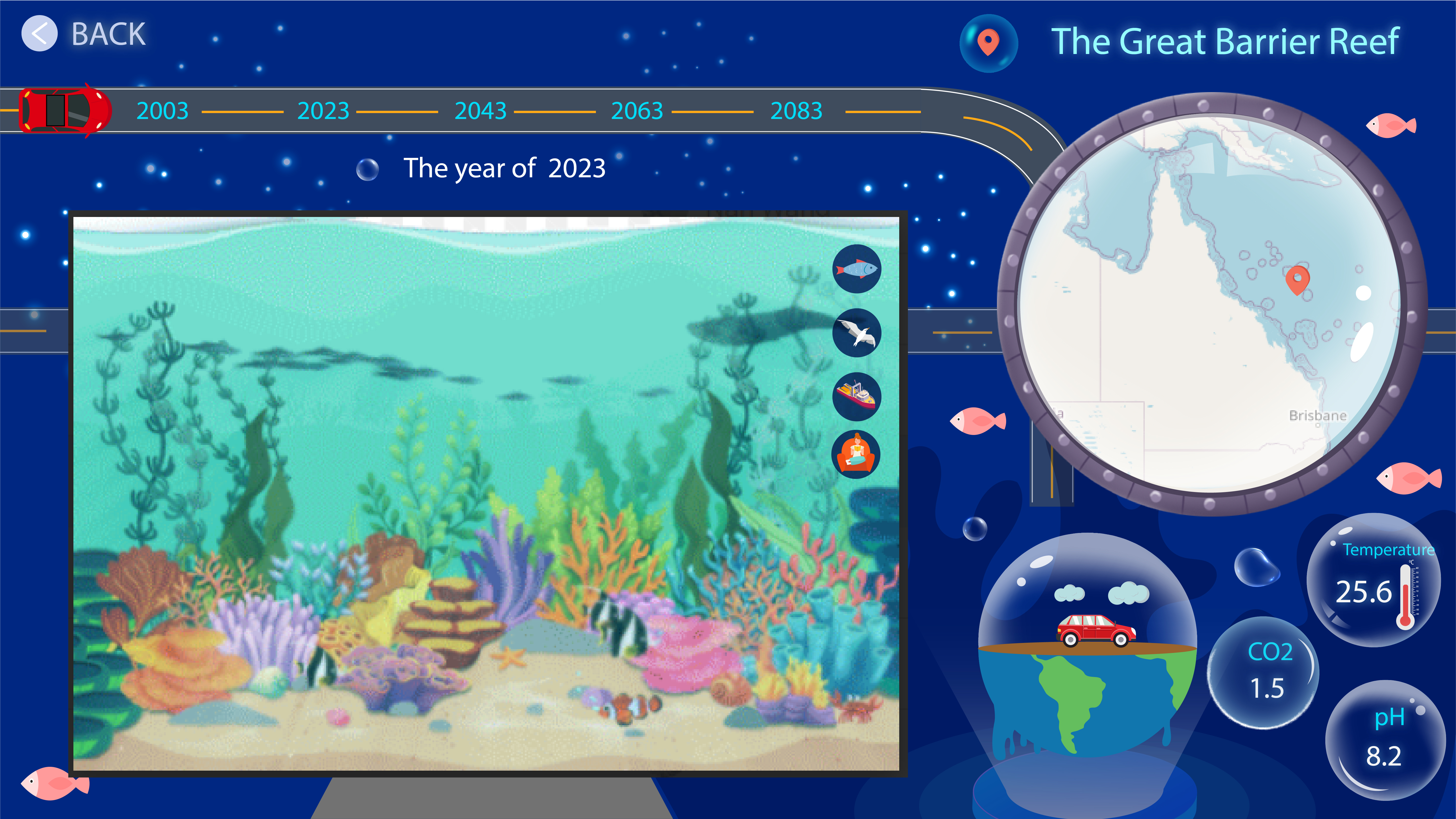
Real-time data: showcases real-time marine data, including temperature, pH, salinity, and pollutant levels, providing users with an overview of the current oceanic conditions.
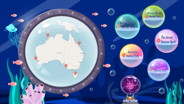
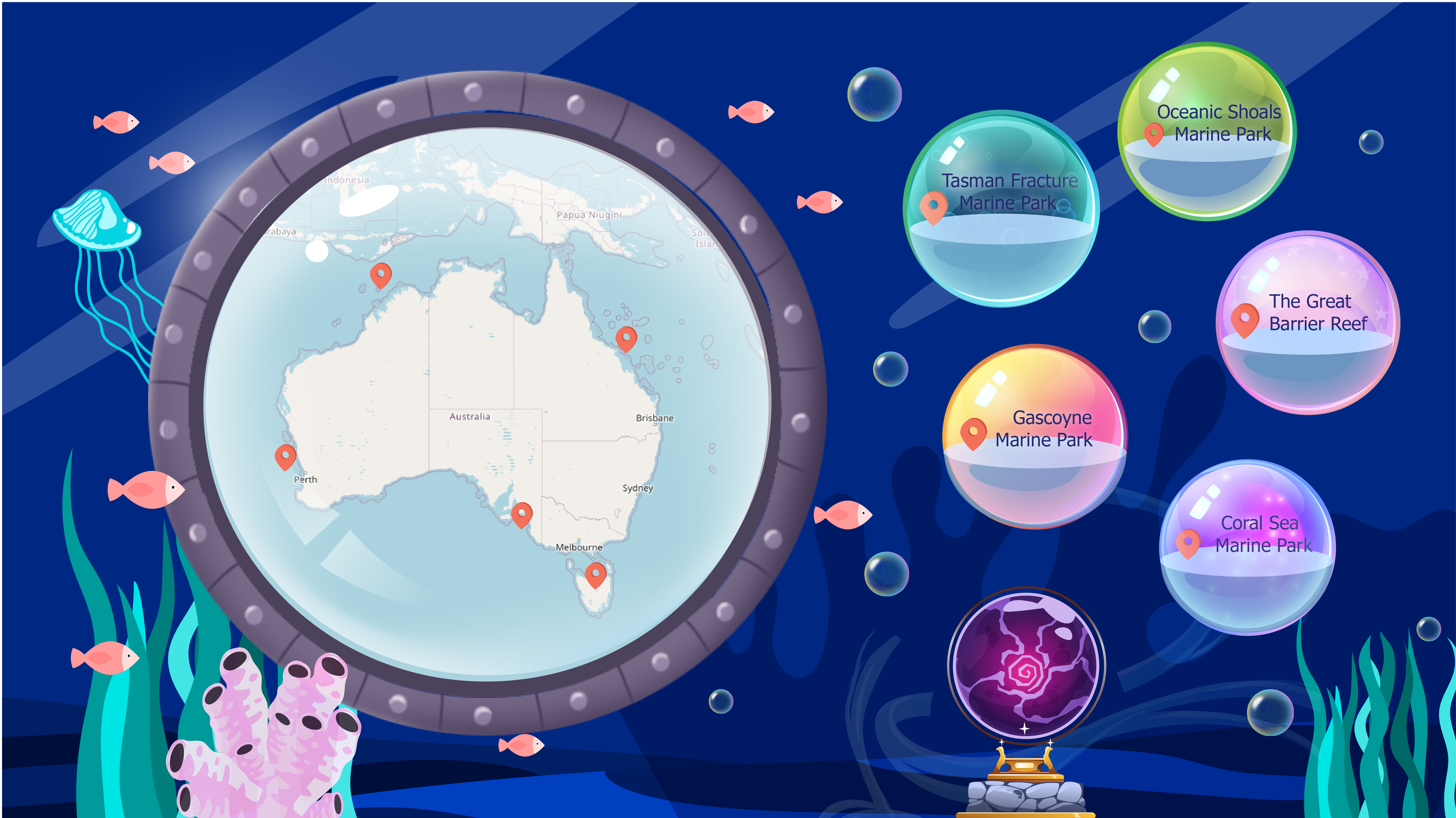
Explore location map: enables users to navigate and discover marine parks through visual representations on a map interface, offering essential information about each park.
Tutorial page: Guides users how to engage with physical interactions, facilitating effective navigation and utilization of the website's features.
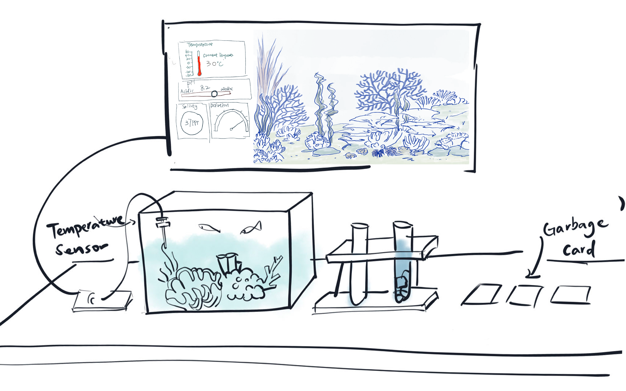
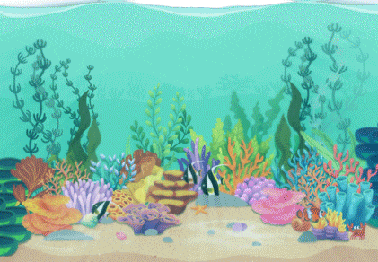
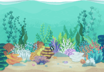
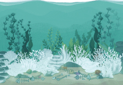
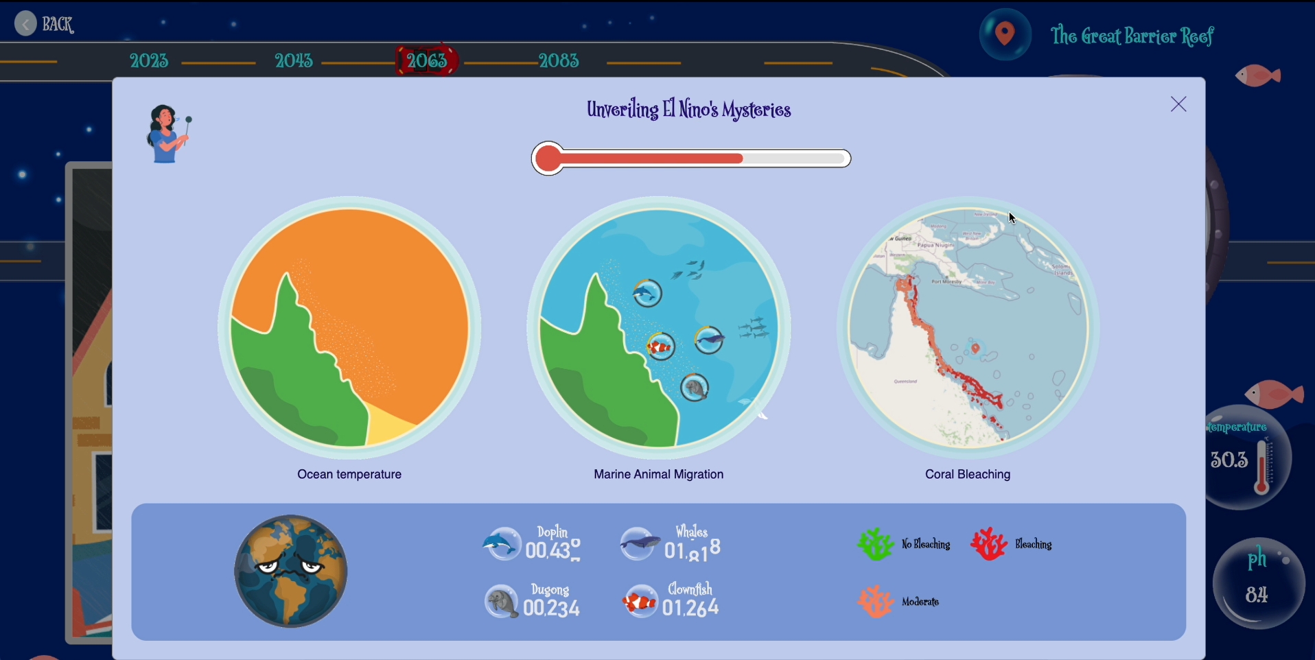
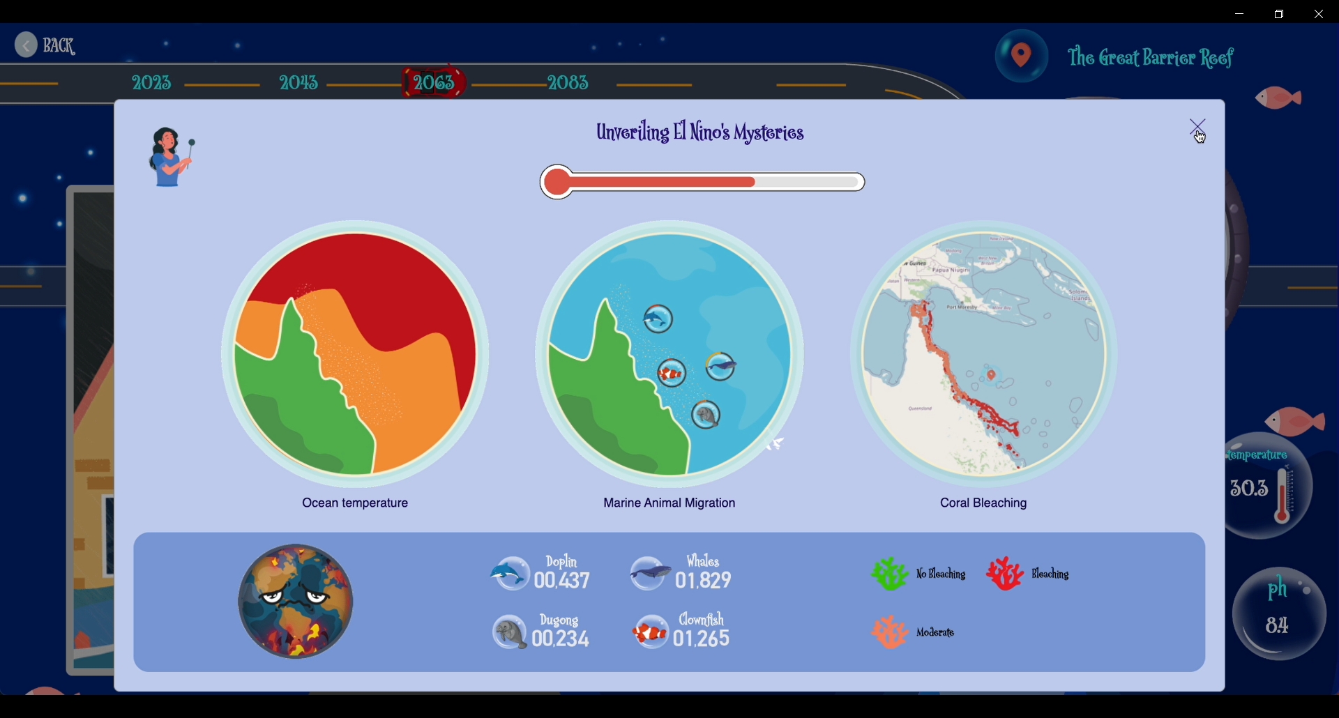
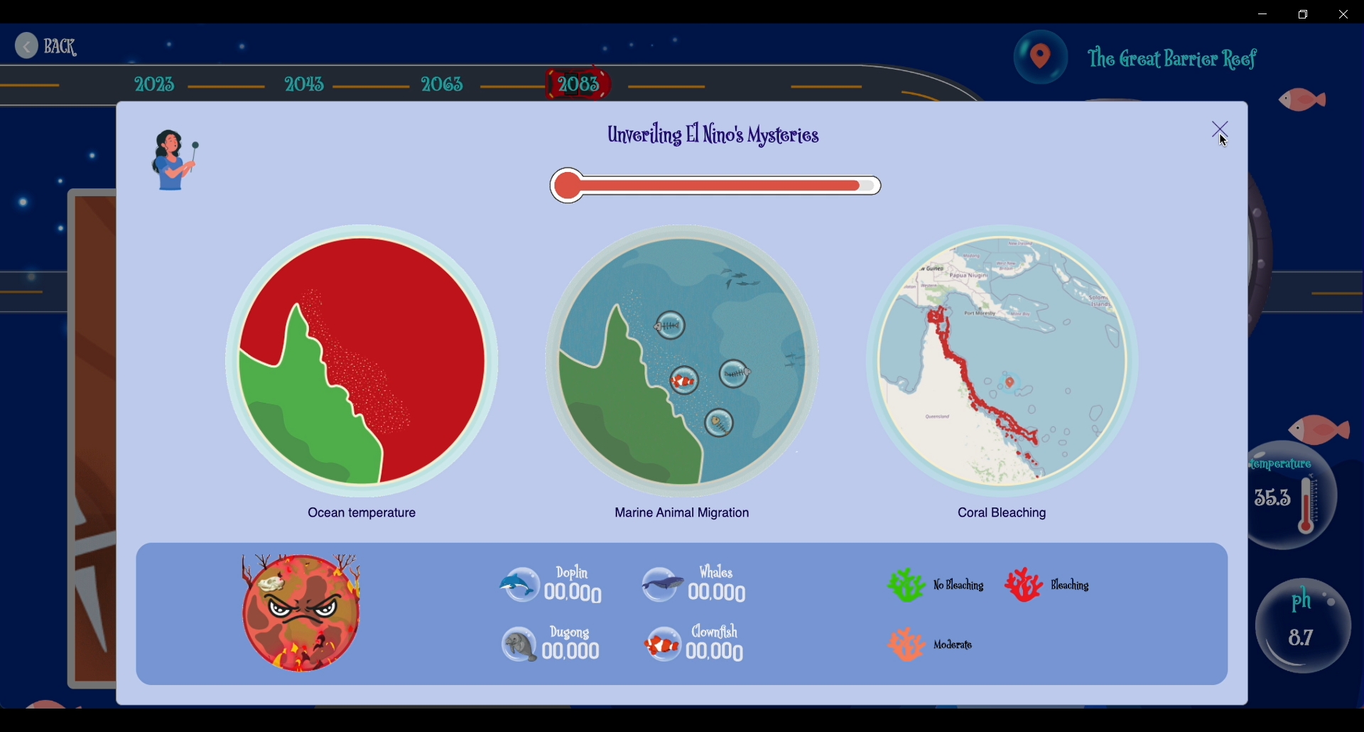
Coral bleaching Map: Visually represents the extent and impact of coral bleaching across different regions.
Timeline Switching: Users can traverse through various time periods to explore future oceanic conditions.
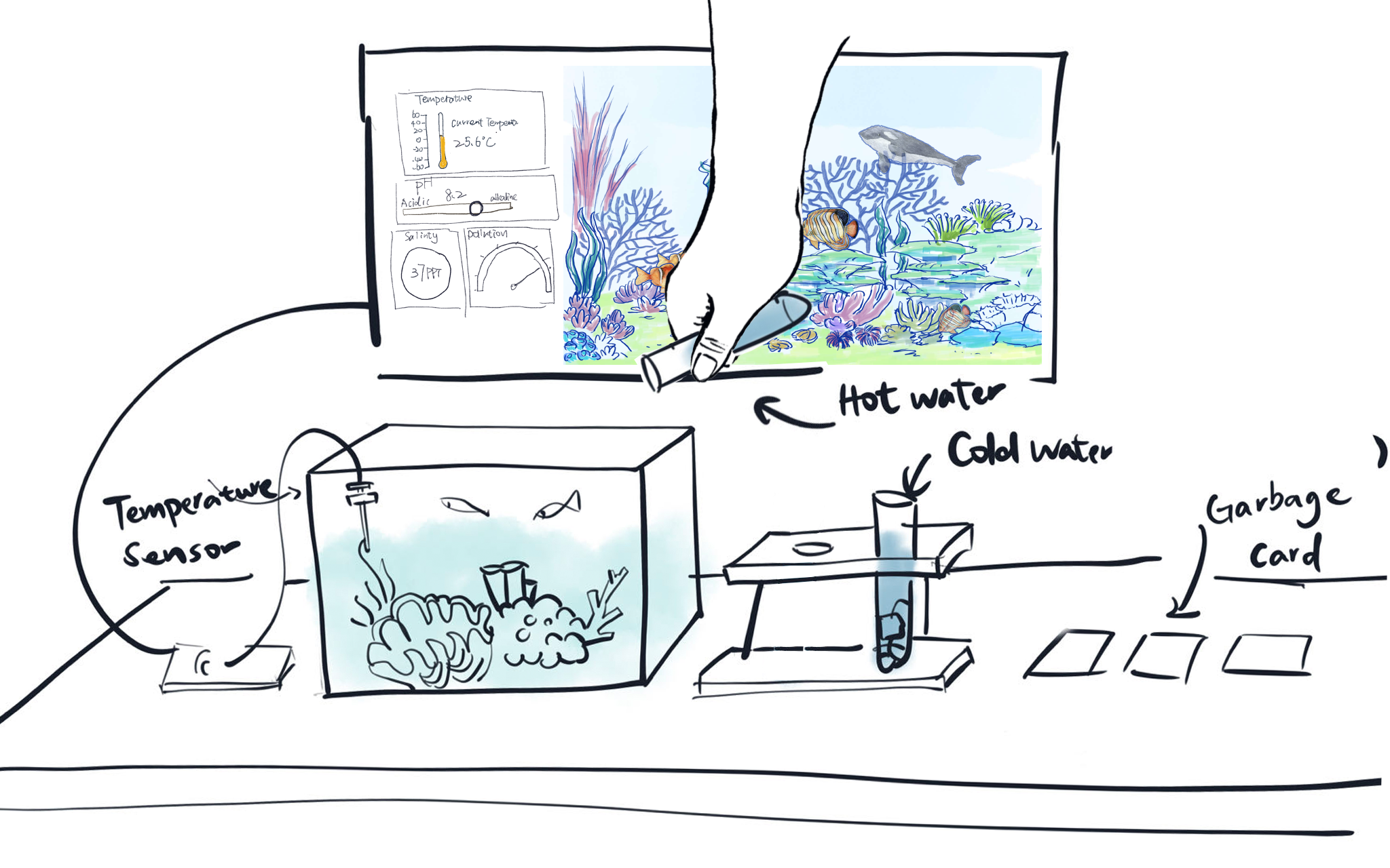
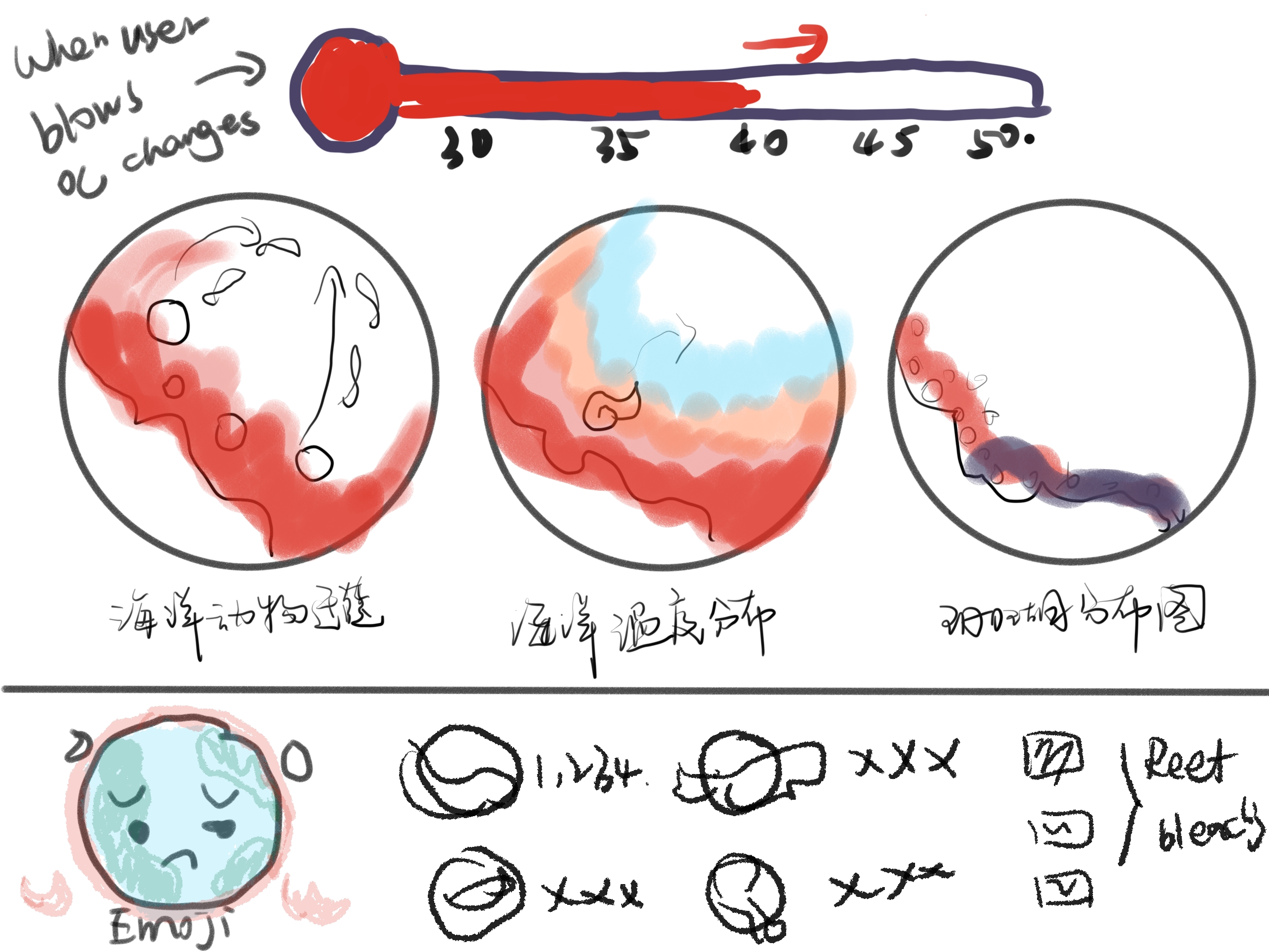
Blow Function (Physical): Users can physically blow into a device to simulate an El Niño event, providing an interactive and immersive experience in understanding its environmental impact.
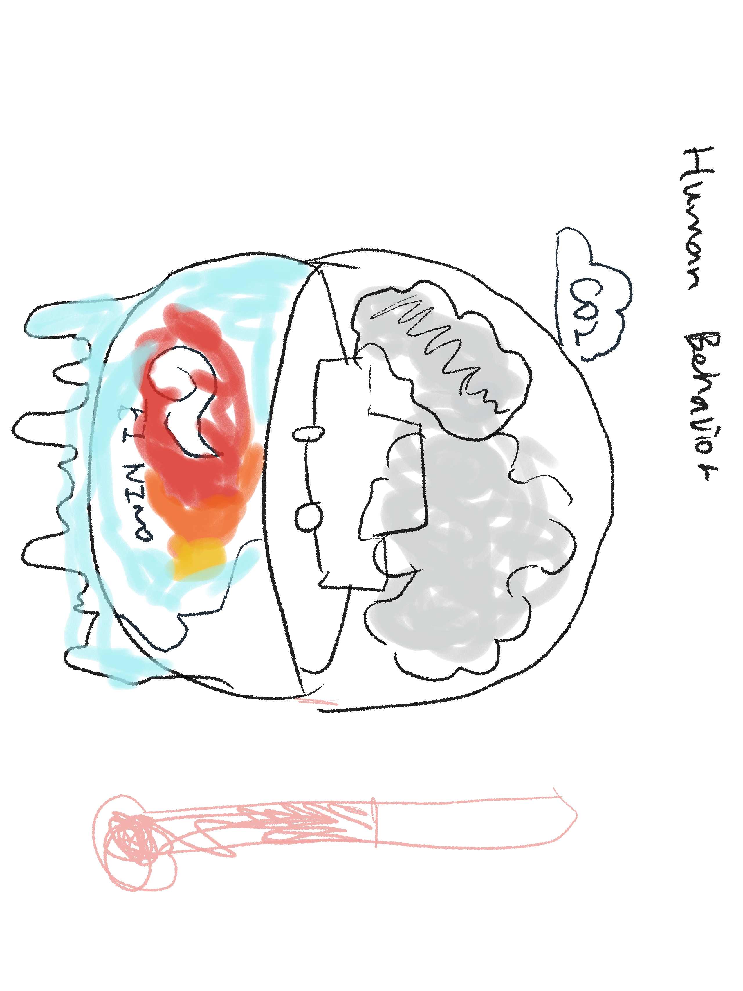
Pour Hot Water Function (Physical): Allows users to pour hot water physically, symbolizing the emission of CO2 from driving cars and its contribution to oceanic temperature rise.
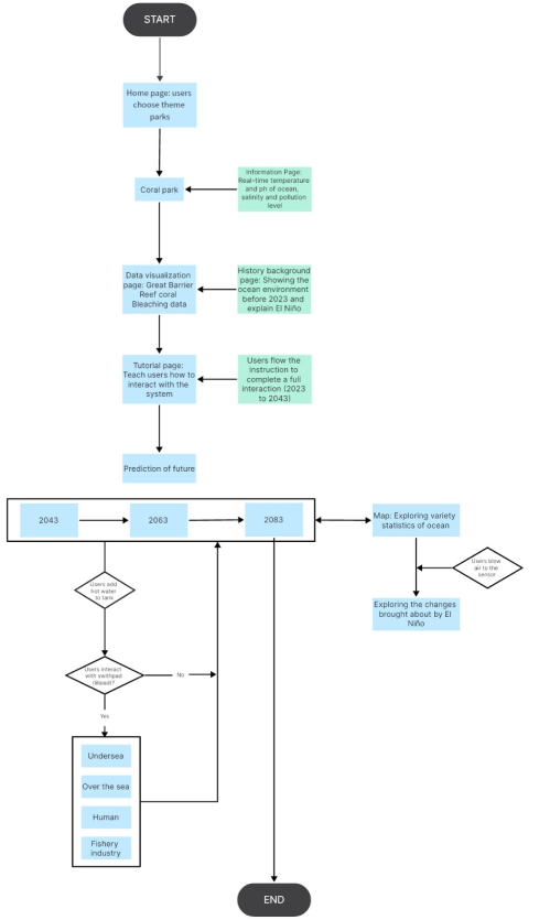
Users navigate through six themed regions, accessing real-time ocean data and educational content on coral bleaching and the El Niño phenomenon. After a tutorial, users interact with a prototype simulating three years (2043, 2063, 2083), exploring the impact of rising ocean temperatures on corals by pouring hot water into a fish tank. They can also observe marine life data growth on a map page and simulate El Niño effects by blowing into a voice sensor. Once users explore all three years, their interaction with the prototype concludes, providing an immersive and educational experience on marine ecosystem dynamics.
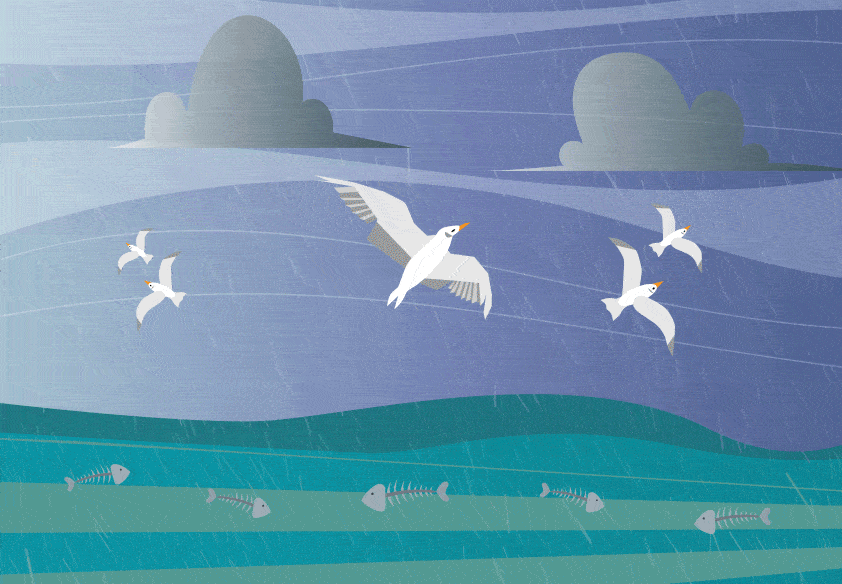
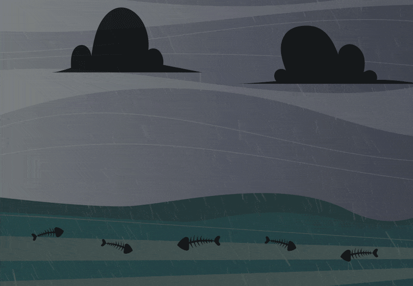
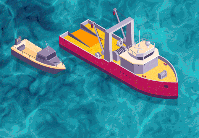
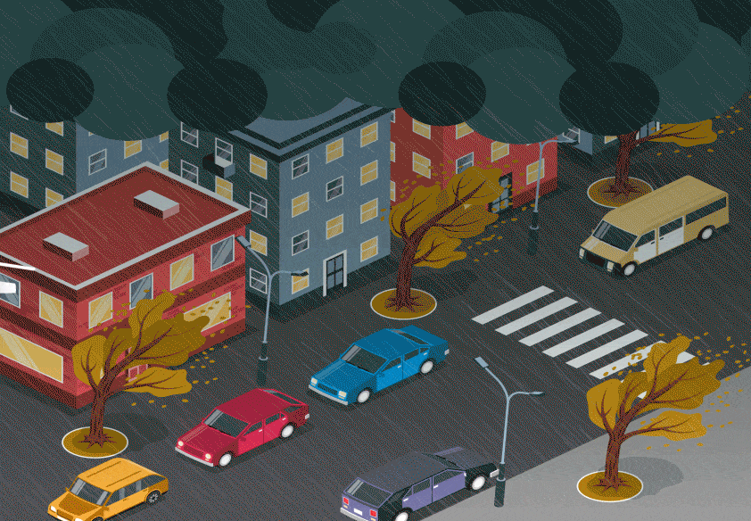
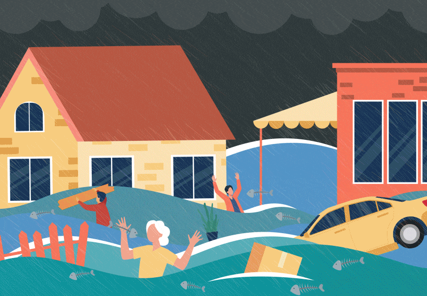
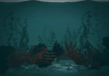
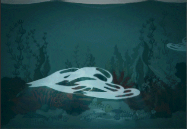
To visually convey the oceans' vulnerability and deepen environmental awareness, we adopt a futuristic design tone infused with pessimistic warnings. Our design presents future environmental changes resulting from human destruction, serving as a cautionary tale. Vivid visuals depict coral catastrophes, bird extinction from fish loss, and fish bones on human tables, prompting reflection and action.
To ensure consistency in design, we employ intuitive icons for quick comprehension. A unified oceanic color palette evokes nature, tranquility, and comfort, with bright and light hues for a pleasant visual experience. Given teenagers' curiosity and love for exploration, the UI incorporates numerous exploratory elements to engage users.
Marine organisms' responses to environmental changes are direct and observable, making them an effective tool for conveying complex data to users who may lack intuitive cognitive abilities for numerical metrics.
By incorporating storytelling throughout interactive pages, users become emotionally invested in the journey. Interactions follow a timeline depicting future global warming impacts, prompting users to explore human life events, seabird situations, and potential El Niño occurrences. Users advance the story, fostering an immersive experience.
The physical prototype employs interactive storytelling to visualize various types of big data. Animated GIFs are strategically placed on the web page and triggered by sensor inputs, creating a dynamic storytelling experience aligned with the timeline. Users receive visual feedback for each interaction, enhancing engagement and understanding of the environmental impact.
Before sketching the low-fi prototype, I have set three initial features that need to have on this project, including Real-time data visualization, Coral bleaching visualization, and Timelines influenced by human behavior. Some HCI knowledge and notions were used in this project. For example, dark patterns and nudges are the two most common artifices to catch people's attention.
Knock-on effects on the undersea, seabirds, fisheries and human life due to excessive human behavior.
The effects of El Niño on sea temperature, coral bleaching, marine animal migration.
Future iterations aim to explore multi-dimensional immersive experiences by integrating additional sensors and interactive modalities like sound and touch. Minimizing mouse reliance and adopting more intuitive interaction methods will deepen user engagement and emotional resonance.
Exploring diverse scenarios can illustrate potential recoveries or preservation efforts, offering users a more comprehensive understanding of marine ecosystems.