The original fact 01:
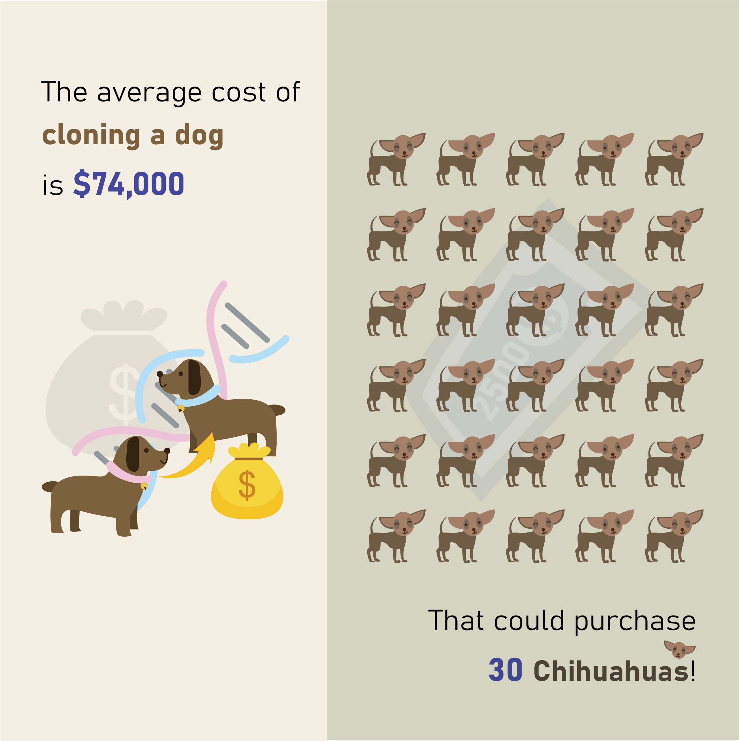
“Average cost of cloning a dog: $50,000 (April 2022 • Source: ViaGen Pets (Cedar Park, Tex.) )”
Approach:
Visual: A set of contrasting visuals was created to illustrate the comparison. On the left side, two identical dogs were depicted to represent cloning, with genetic elements in the background. Money and arrow icons were added to symbolize the cost and process of cloning. On the right side, a group of 30 Chihuahuas was shown, accompanied by a background pattern of $2500 bills, emphasizing the price of each dog. The visuals aimed to provide a clear and intuitive understanding of the cost disparity between cloning a dog and purchasing multiple Chihuahuas.
Color Scheme: A grayish green and yellow color palette was chosen for the background to maintain visual balance with the drawn dogs. The text color corresponded with the item's price, with enlarged figures for emphasis. Yellow and purple were used as contrasting colors to highlight prices and ensure clarity. The background colors were intentionally contrasted to visually separate and differentiate between the two subjects, aiding in comprehension.

The original fact 02:
Estimated portion of passengers on private jets who fly with a pet: 1/4 (April 2022 • Source: Aerial Jets (Lighthouse Point, Fla.))
Approach:
Visual: For cohesive visuals, I structured the design from top to bottom, integrating text and graphics. To highlight the concept of traveling with a pet on a private plane, I creatively incorporated the shape and interior elements of an aircraft. This included comfortable seats to convey the private jet setting. To emphasize the "1in4" statistic, I depicted four people in the image, with one passenger holding a dog. A speech bubble background was added to highlight the data, accompanied by a small airplane icon for visual impact.
Color Scheme: A neutral gray background was chosen for balance. Brighter colors were used for the passenger with the dog to distinguish them from others. Text colors were selected to reflect the data theme, such as blue for "private plane" and the color of the dog for "a pet". Text was enlarged to draw attention to key values.
The original fact 03:
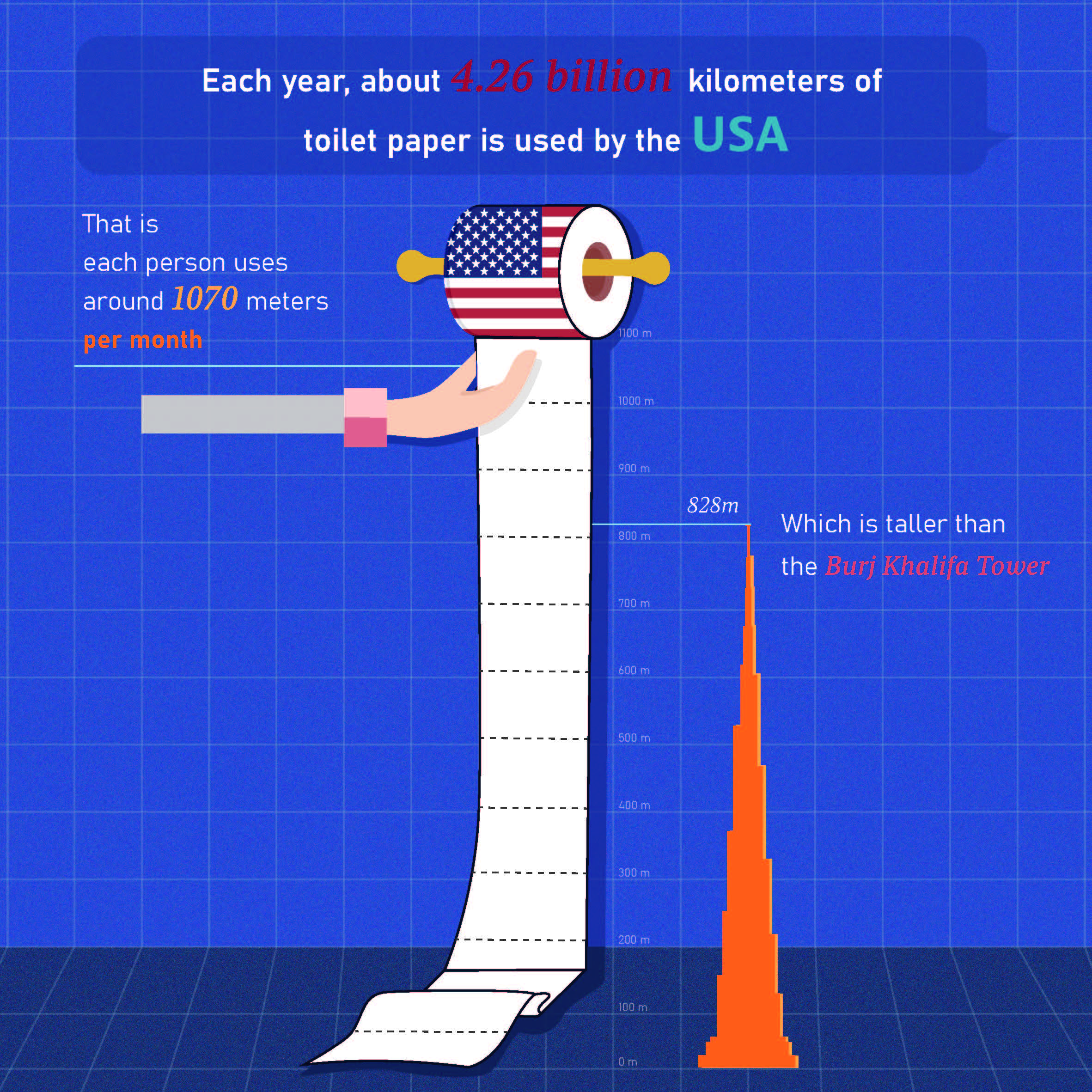
Estimated miles of toilet paper used in the United States each year: 2,650,000,000 (May 2022 • Source: QS Supplies (Leicester, England))
Approach:
Visual: A top-down structure was utilized to segregate text and graphics, featuring a bathroom wall background with a roll of toilet paper adorned with the American flag. The symbolic silhouette of the Burj Khalifa was placed to scale on the right, providing a visual reference for comparison. On the left, a hand holding toilet paper was drawn to signify the data's subject. Each grid in the background represented 100 meters for added clarity.
Color Scheme: A blue background was chosen, contrasting with an orange-blue hue for the Burj Khalifa silhouette to enhance visibility. Colors from the American flag (red and blue) were used for the text, enlarged for emphasis. A darker blue shade was added beneath the facts to create visual depth and highlight key information.
The original fact 04:
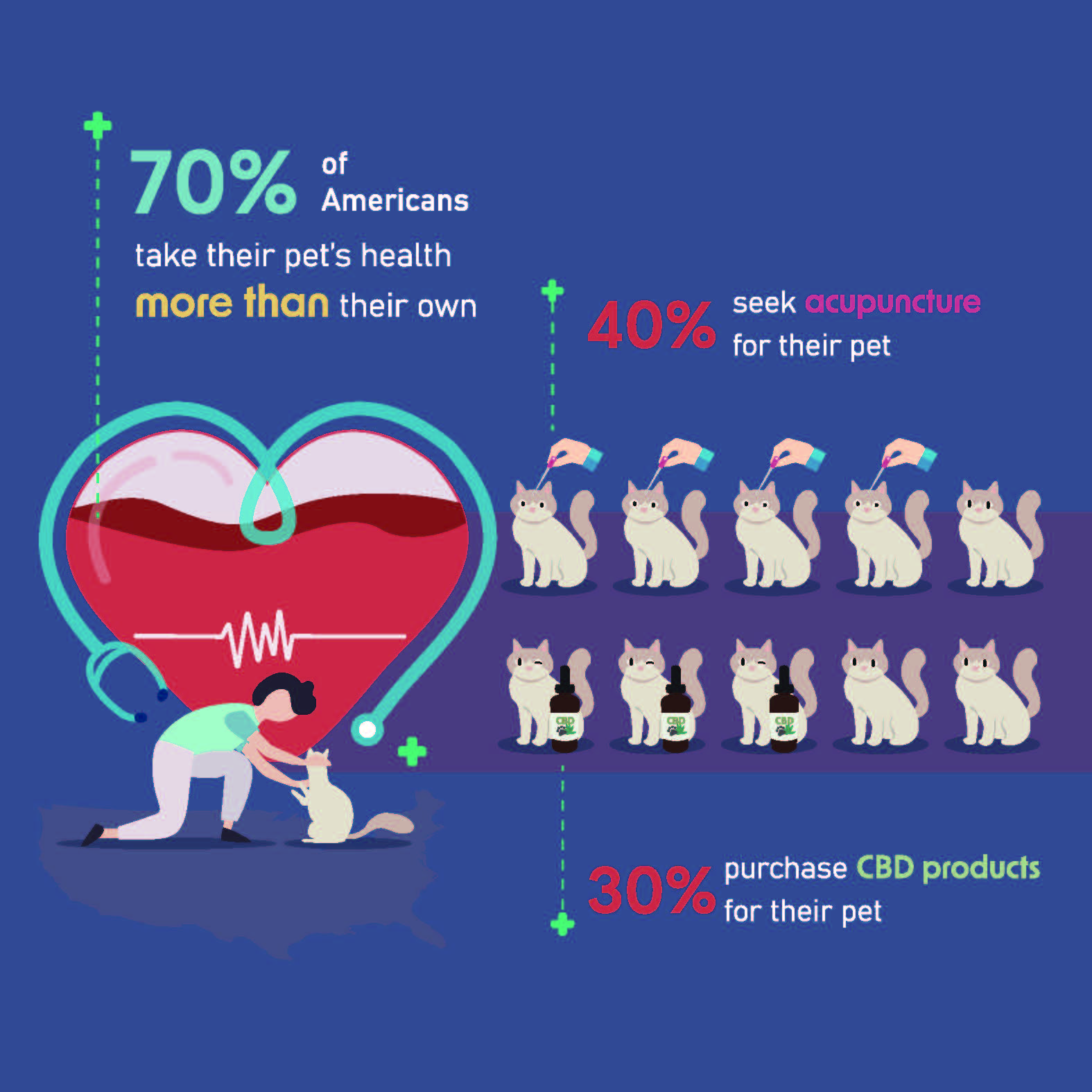
Portion of U.S. pet owners who say they take their pet's health
more seriously than their own: 7/10
Who have sought acupuncture for their pet: 4/10
Who have purchased CBD products for their pet: 3/10
April 2022 • Source: OnePoll (NYC)
Approach:
Visual: I adopted a left-right layout to visually convey the data. On the left, a person is depicted petting their companion animal, with a heart symbolizing their bond. The heart is partially filled, representing 70%, and features a health icon and stethoscope to emphasize pet health. A map of the United States is included to indicate the data's relevance to the country. On the right, ten cats are depicted, with four wearing acupuncture symbols and three accompanied by CBD products, representing 40% and 30% respectively. The use of symbols helps viewers grasp the information more easily.
Color Scheme: The blue background signifies health, with light blue text for clarity. Red font is used for the percentages to highlight key data, while a purple block indicates the related statistics for acupuncture and CBD. Green dotted lines with medical icons draw attention to each fact.